One of my favorite events last year was the Designer Visions: Cinema Style sponsored by Hearst magazines and I couldn't wait to see what they had up their sleeve this year. They have paired three of their magazines with three top designers to create apartments that were inspired by films all set in New York. They include Phoebe and Jim Howard for House Beautiful - Something's Gotta Give; Steven Gambrel for Town & Country - Six Degrees of Separation; and Richard Hallberg for Veranda - Wall Street. They have also partnered with Bizzi & Partners, the developers of The Setai Fifth Avenue and all of the fabulous spaces are located on the 58th floor with amazing views. Each will also be featured in the respective magazines. House Beautiful has already featured Phoebe Howard's creation in the November issue and you can see Steven Gambrel's in the December issue of Town & Country, while Richard Hallberg will be able to be seen in the January issue of Veranda.
Note: If you'd like to tour all three spaces, you can do so while supporting a wonderful charity, Baby Buggy, this Thursday, November 11th and Saturday, November 13th. Tickets and more information are available on Gilt City.
In this post, I am featuring Phoebe and Jim Howard's space that was inspired by Something's Gotta Give. It's not a complete literal translation of the look in the movie but picks up where the film left off. It explores what happens after Harry and Erica move in together. How would they merge their styles and needs in one fabulous space. In this case, they each have a study but share a dreamy master bedroom. There are cute little nods to the film such as the framed records that are labeled with Harry's record company name as well as the Chateau Margot wine that Harry bought at the auction where he met Erica's daughter.
As you know, I'm not a fan of new construction so I always find it so interesting to see how designers tackle a space without architectural details. In a modern building, what you are really buying is the view and in this case, it is amazing. I love that you can see the Chrysler Building from many of the rooms in this apartment.
The windows do take up a lot of wall space so all the designers displayed art on easels.
Jim Howard designed the etagere that houses the flat screen and all their books.
I love the open and airy feel of the etegere. It seems to float in the room and works well with all the lighter colors.
You can't tell in this photos but the artwork contains bits of diamonds and sparkles in the light.
The dining table shares space in the living room.
Each place setting was set for one of the characters in Something's Gotta Give.
I'm also not a fan of open kitchens but this one actually doesn't stand out and works well with the rest of the room.
I didn't get a good photo of it but the HVAC units have been housed in little closets do you don't have to see those awful large units that they usually install in new construction. In the kitchen, it is to the right of the cafe table.
How would you like drinking your morning coffee in front of that view? It would definitely help wake you up!
The artwork throughout the space also had a dreamy and quiet feeling.
Harry's office/den also has an amazing view.
The desk is by Lucien Rollin.
All the rooms have bits of shine and mirror which add to the glamorous feeling.
Of course Harry's office needs a bar.
The black and white photos are of New York and Paris, the two cities with special meaning to Harry and Erica.
I love this vignette that was tucked around the corner. It would the perfect place to store all of Harry's papers.
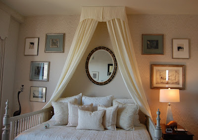
Erica's retreat is dreamy and quiet. The day bed also serves as a place for overnight guests including her grandchildren.
Jim Howard designed the bed. The wall and drapery fabric is Mark Alexander by Romo's Jahangir.
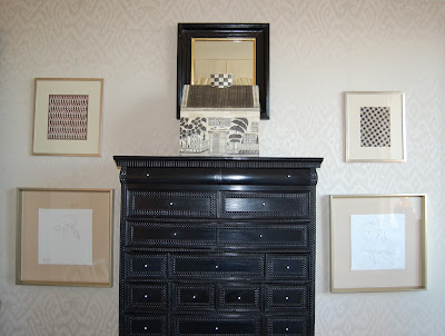
I love all the artwork in this room that looks collected. The colored mats also pop off of the neutal walls.
A bone box from John Rosselli sits on an 18th-century Portuguese cabinet from Lee Calicchio.
Framed records from Harry's label.
The dreamy master bedroom.
You can see how the room changes as the light outside changes.
The fabric covered walls help to warm up the walls in a modern apartment and create a cozy bedroom.
The framed photos of Erica and Harry were a sweet touch.
You can see here that although the lamps are the same, there are different nightstands. You don't have to always match everything in a room.
The Hickory Chair nightstand holds Erica's Tony Award for her play about Harry and also her glasses.
I like how they tucked the television in the corner so you don't even see it when you enter the room.
Hope they install some privacy shades in the bathroom!
It would be fun to relax in the Kohler tub while you gazed at the view!
I would definitely like a little more privacy but that's just me!
But the view is to die for!
Photos by Heather Clawson for Habitually Chic and from Hearst magazines


0 comments:
Post a Comment